

Melbourne
night
in
early
2000's
&
Geolocated
mystery romance
Tonight Again
Tasks
Research
Concept Development
Location Analysis
Narrative Design
UX UI Design
Wireframing
Prototyping
User Testing
A geolocated mobile narrative app that takes a love story from early-2000s Melbourne and hides it inside the city, familiar places. Before people were constantly connected through mobile phones. Read the clues, walk the streets, and find out pieces of their heart.
Tools
Figma
Google map
Photoshop

Overview
The experience unfolds across ten selected Melbourne locations, where each stop reveals part of a hidden story. The app combines clue-solving interactions, arrival confirmation, ambient visuals, and an archive system to create a slower, more mysterious and emotional way of moving through Melbourne city after dark.
The
Idea
Given a brief to create a geolocated narrative app,
Instead of a city tour, I built a treasure hunt around a love story that set in early 2000's - Melbourne before mobile phones changed how people found each other. Across ten real CBD night venues, pub, restaurant that have been standing since then. You read the poetic scene, name the place right, navigate there and confirm arrival. Each stop unlocks the next chapter and a reward from that venue. Sun down, google map, no guidance except the story itself.
When I go out at night in the city , it's usually dinner or drinks, it does feel a bit repetitive sometimes
I pass the same places every day and never really see them. I just want someone to give me a reason to actually stop there
I'd love to discover new spots I wouldn't normally notice actually, I just haven't got a chance to do so
We always end up at the same bar because no one can think of anything to do better
There's so much history in these streets but now only a place to get drunk on a weekend night
All the platform just got the same top 10 list city dinner. I already know those places and they're always crowded
Research speaks:
Understanding the player and the city
Five Melbourne locals joined a focus group to talk about how they move through the city at night and the pattern was consistent. Most nights felt predictable, cycling through the same bars and the same routines, even in a city with as much to offer as Melbourne's CBD. That familiarity was the gap the design needed to fill.

-
All 5 agreed clues needed to be short and poetic. Long text could kill the mood but if a story worth following, They'd stay for that.
-
70% raised safety and walkability unprompted, which shaped every location choice toward central, well-lit, familiar streets.
-
4 out of 5 responded positively to digital collectibles like a photo strip, a fortune cookie, a bookmark for something to hold onto after it ended
-
All 5 saw it primarily as a date activity, though most said they'd try it with close friends too.
-
All 5 were already confident navigating the CBD on foot, which meant clues could stay subtle and poetic. The city could do the work.
Design Challenge:
Empathise with
the users
User interviews and testing revealed a clear pattern, people knew Melbourne city had more to offer, but routine kept pulling them back to the same places. Most location-based apps weren't helping, either too guided or too game-like to feel like a real night out.
The real problem was how to build something with all the structure of a game without it ever feeling like one? The interface had to stay invisible enough for the story to breathe, but clear enough that people knew what to do next. The writing had to earn the walk. And the locations had to do emotional work, not just serve as coordinates.
The wider literature on locative media focuses almost entirely on museums and tourism. There was almost no guidance on designing for night-time urban exploration, or for storytelling that is intimate rather than educational. That gap was the opportunity.
"
How might we transform familiar Melbourne streets into an interactive story that feels nostalgic, mysterious, and worth uncovering?
"
Research &
Testing Doc
01
Location - based experience
Research and Brainstorming
02
Melbourne’s night culture [ Focus group Session ] and Location research
03
Field Testing with the Prototype beta
04
Outcome Report
Persona
The player we design for

Introducing
Tonight Again
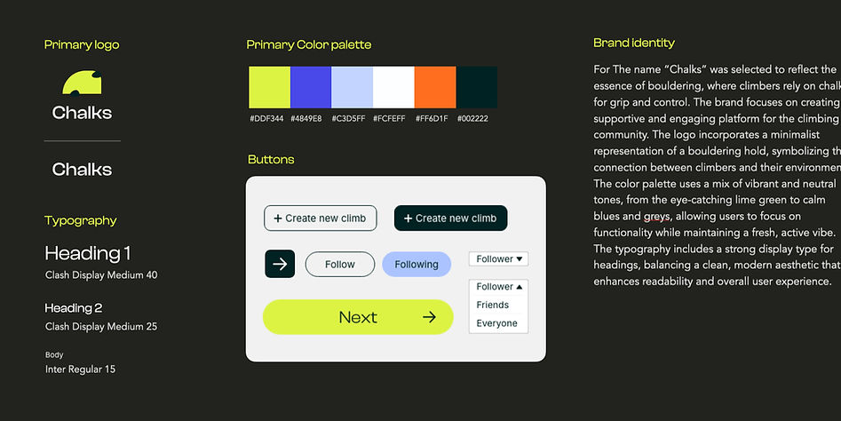
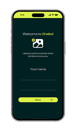
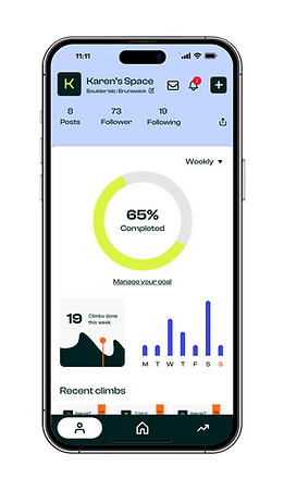
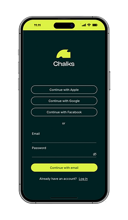
A climbing companion app designed to bring together key tools climbers actually use, all in one place. From logging sends and tracking progress, to creating custom Kilter Board routes, checking gym set schedules, and casually exchanging beta on a shared board. Inspired by gaps in existing tools, Chalks blends training, creativity, and community into a more intuitive experience for everyday climbers.


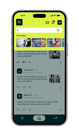
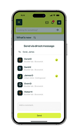
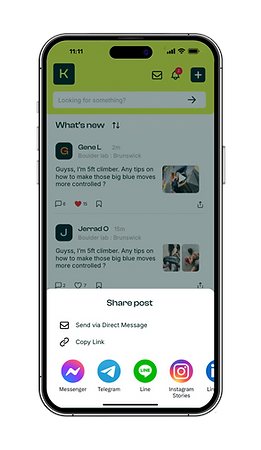
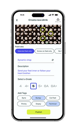
MOBILE INTERFACE DEVELOPMENT


DESKTOP INTERFACE DEVELOPMENT

Development process, design decisions, and key takeaways from prototype testing
Prototype Report
-
95% of test users found the app layout intuitive, giving it an average rating of 4.6 out of 5 for ease of navigation. Most users noted that the flow from Home → Log Climb → Stats felt natural and required little explanation.
-
Users rated the Community Board feature highly, with an average score of 4.8 out of 5. Testers appreciated having a space for casual beta sharing and said it felt “supportive” and “less intimidating than asking people at the gym.”
-
90% of participants said the progress tracking visuals motivated them to climb more consistently. They highlighted the clarity of the stats screen and the simple logging system as major strengths.
-
Testers valued the Kilter-style set creation tool, describing it as fun, fast, and “surprisingly easy to experiment with.” Many said they would use it to create problems for friends or for personal training goals.
-
100% of users gave the overall usability of the prototype a 9 or 10 out of 10, noting the clean design, friendly tone, and modern feel. They felt the app captured the social and creative side of climbing without overwhelming beginners.
“Super clean and easy to use. I’d actually log my climbs with this. Everything feels straightforward and not overwhelming.”
“The stats page is my favourite. It makes progress feel rewarding instead of stressful. I can instantly see how I’m improving.”
“Love the community board. It feels like real climbing energy… people sharing beta without the pressure of asking at the gym.”
“The design is modern, friendly, and not too busy. It feels like an app made for climbers, not just a training tool.”
To be continued
If Thaiwander were to move to the next phase, here’s what I’d explore:
-
Strengthening the community layer by improving participation in comments, shared beta, and personal profiles, while acknowledging that many climbers prefer low-pressure social spaces.
-
Introducing a “Nearby Gyms” and “Set Map” feature so users can instantly see new routes, freshly set walls, or trending climbs in their area.
-
Developing personal training tools such as streak tracking, level progression, and tailored challenges to help climbers stay motivated over time.
Key takeaway
The project was a major learning milestone and gave me a deeper understanding of designing for niche communities. At first, I focused heavily on creating new features, but I soon realised that value often comes from refining what climbers already do naturally: track progress, share beta, and stay motivated.
Chalks reinforced the importance of clarity, accessibility, and building digital spaces that feel welcoming rather than intimidating. The process highlighted that strong user experience often comes from thoughtful improvements, not reinventing the entire system.